The Ghost in the Font: Typewriter Fonts and Their Literary Associations
There's a particular scent that clings to old typewriters: a mingling of dust, dried ink, and the faintest whisper of paper. It's a fragrance that instantly transports me, and countless others, to a different era – a time of crisp white shirts, intense concentration, and the satisfying clatter of keys. More than just machines, typewriters were portals to creativity, and that connection is inextricably linked to the fonts they presented. It wasn't a choice in the way it is today with a dizzying array of digital options; instead, it was the font *of* the typewriter, and its character profoundly shaped the literature it helped to create.
The Limited Palette: Understanding Typewriter Fonts
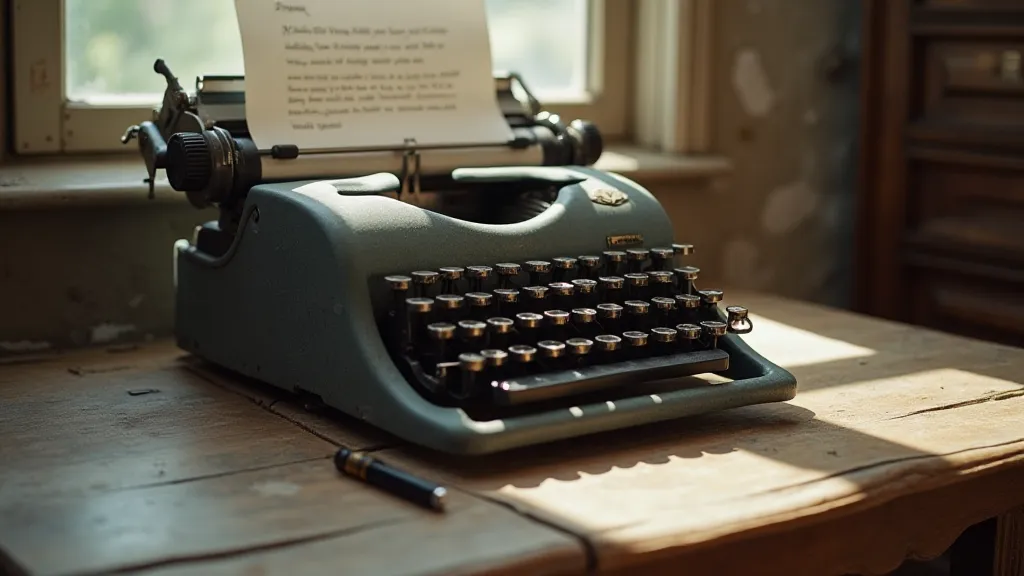
Unlike the boundless possibilities of digital typography, typewriter fonts were defined by the physical form of the typeface. Each character was a tiny, precisely engineered piece of metal, cast in relief. These “matrices” were used to stamp characters onto a ribbon, which then transferred the image onto paper. The options were limited by the manufacturing process and the design choices of the typewriter’s creator. You didn’t *select* a font; you selected a typewriter known for a specific typeface.
Early typewriters, like the Sholes & Glidden (often associated with Remington), famously used a Pica font – a robust, legible, and rather plain style. Its utilitarian nature reflected the early adoption of typewriters primarily for business correspondence. The uniformity, the lack of flourish, was a statement of efficiency. The typeface itself felt like a declaration of factual reporting, the foundation of news and bureaucratic documents. Later, more ornate faces emerged, often mimicking handwriting styles – like the “Script” typeface on some Remingtons – demonstrating an attempt to inject a degree of personality into the mechanical process.
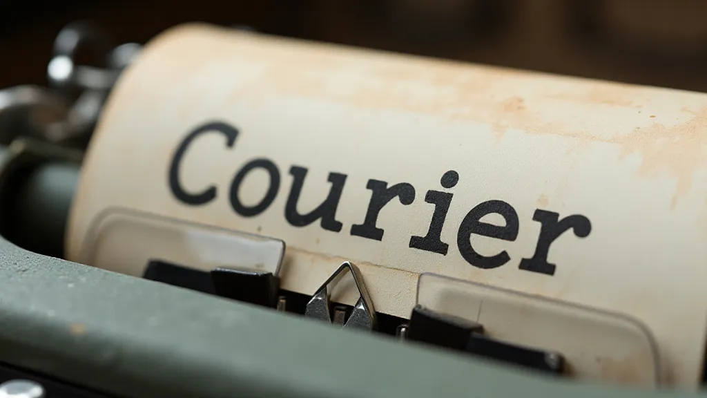
Courier: The Font of Modernism and Beyond
Perhaps the most recognized typewriter font is Courier. Its monospaced design – where every character occupies the same horizontal space – originated with IBM. Initially designed for accounting and coding, its ubiquity came later. It became the font associated with the rise of postmodern literature and the typewriter revival of the late 20th century.
Think of Cormac McCarthy’s stark prose in *Blood Meridian* or Don DeLillo's fragmented narratives in *White Noise*. The rigid, almost sterile appearance of Courier perfectly complements their themes of alienation and existential dread. It lacks any decorative elements, emphasizing the raw, unvarnished words. The fixed width creates a visual rhythm, contributing to the hypnotic effect of their writing. Many aspiring writers adopted Courier specifically to emulate the aesthetic of their literary heroes.
My grandfather, a man of quiet intensity, was one such writer. He penned short stories in a battered Underwood, the keys sticking occasionally, the carriage return demanding a firm hand. He’s gone now, but I still have the Underwood and reams of his handwritten notes, often typed directly into the manuscript. Seeing his words rendered in Courier triggers an immediate and profound sense of connection – a feeling of being in his presence, witnessing his creative process.
The Script Typefaces: Mimicking the Human Hand
Beyond the dominant Pica and Courier styles, some typewriters offered Script typefaces. These attempts to replicate handwriting were often imperfect, charmingly quirky, and often riddled with technical challenges. The result wasn't a flawless replica of calligraphy, but something uniquely its own – a mechanical impression of human script.
Imagine Ernest Hemingway drafting a letter to F. Scott Fitzgerald on a typewriter with a Script typeface. The slightly irregular, almost playful quality of the font might seem at odds with Hemingway’s famously terse style, but it adds another layer of complexity – a hint of the underlying humanity struggling to break free from the confines of the mechanical process. These fonts gave a certain intimacy to the written word, a sense of personal touch absent in the more formal Pica styles.
The Craftsmanship and Legacy
Looking at a vintage typewriter isn’t simply appreciating a piece of office equipment; it’s acknowledging a testament to craftsmanship. The precision engineering required to create the matrices, the intricate mechanics of the machine itself – it's all a remarkable feat of ingenuity. Every key, every lever, every spring worked in harmony to produce the printed word.
Restoring a typewriter isn’t just about cleaning and lubricating; it’s about preserving a piece of history, an artifact of a different era. The subtle variations in the font, the slight imperfections in the printing – these aren’t flaws, but character markers, reminders of the human hand involved in the process. Collectors often seek out typewriters with specific fonts, recognizing the unique aesthetic they represent.
The ghost in the font isn't just a metaphorical concept; it's the echoes of the writers who used these machines, the countless words they produced, the ideas they shared. It’s the tactile connection to the past, the appreciation for the beauty of a simple, mechanical process. And it’s a reminder that sometimes, the most profound creativity emerges from the most unexpected constraints.
The Enduring Appeal
While the digital age offers countless fonts and boundless creative possibilities, there's an undeniable appeal in returning to the limitations of the typewriter. It forces a different kind of focus, a deeper engagement with the words themselves. The clatter of the keys, the tangible connection to the printed page – it’s a sensory experience that a computer screen simply can's replicate. Perhaps, in a world increasingly dominated by screens and pixels, the ghost in the font offers a much-needed connection to something real, something enduring, something profoundly human.